ae ceramics
--
Type: Identity design and tableware – concept
Design by: Anny Follesøy
Photo by: Anny Follesøy
Year: 2021
--
Type: Identity design and tableware – concept
Design by: Anny Follesøy
Photo by: Anny Follesøy
Year: 2021
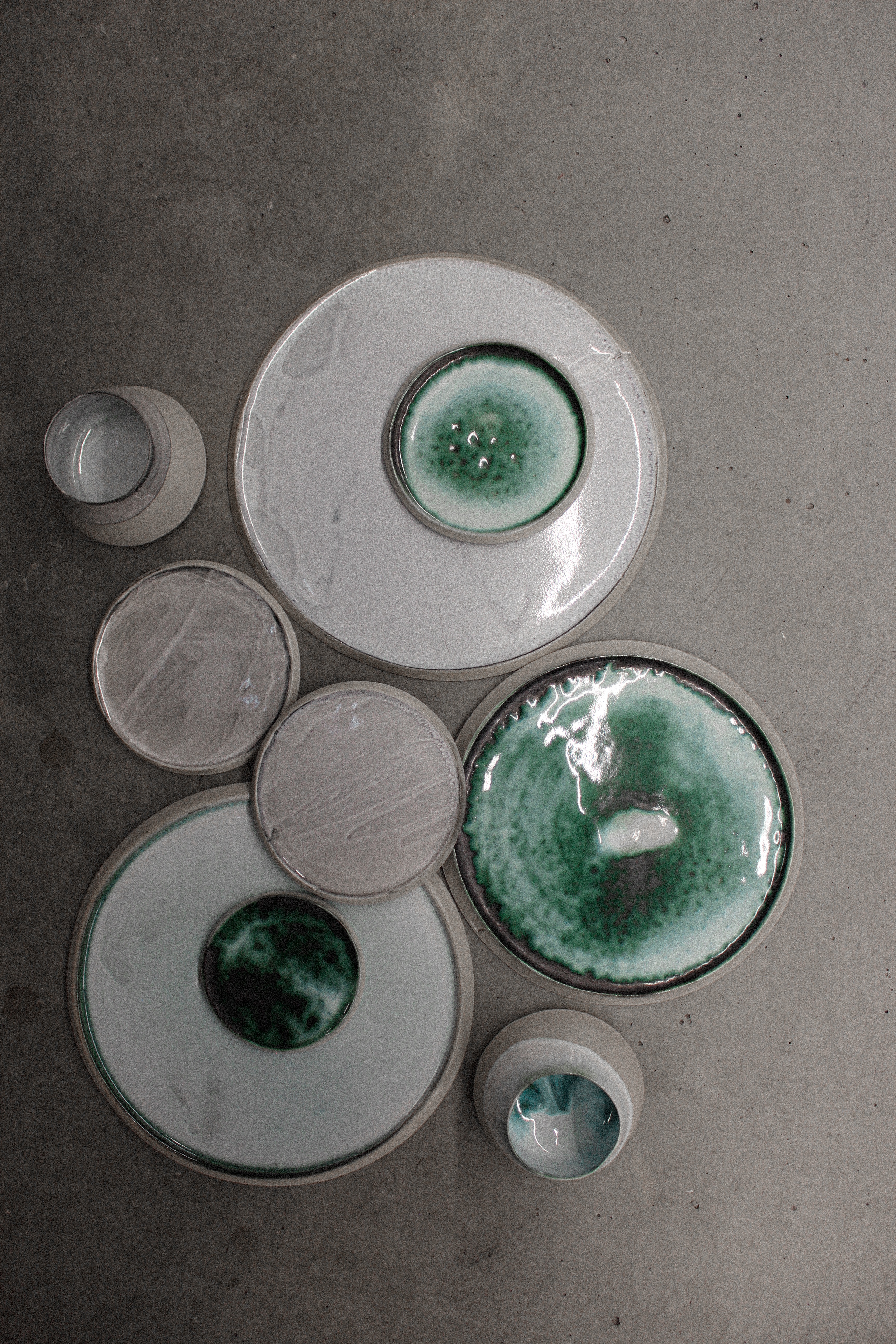
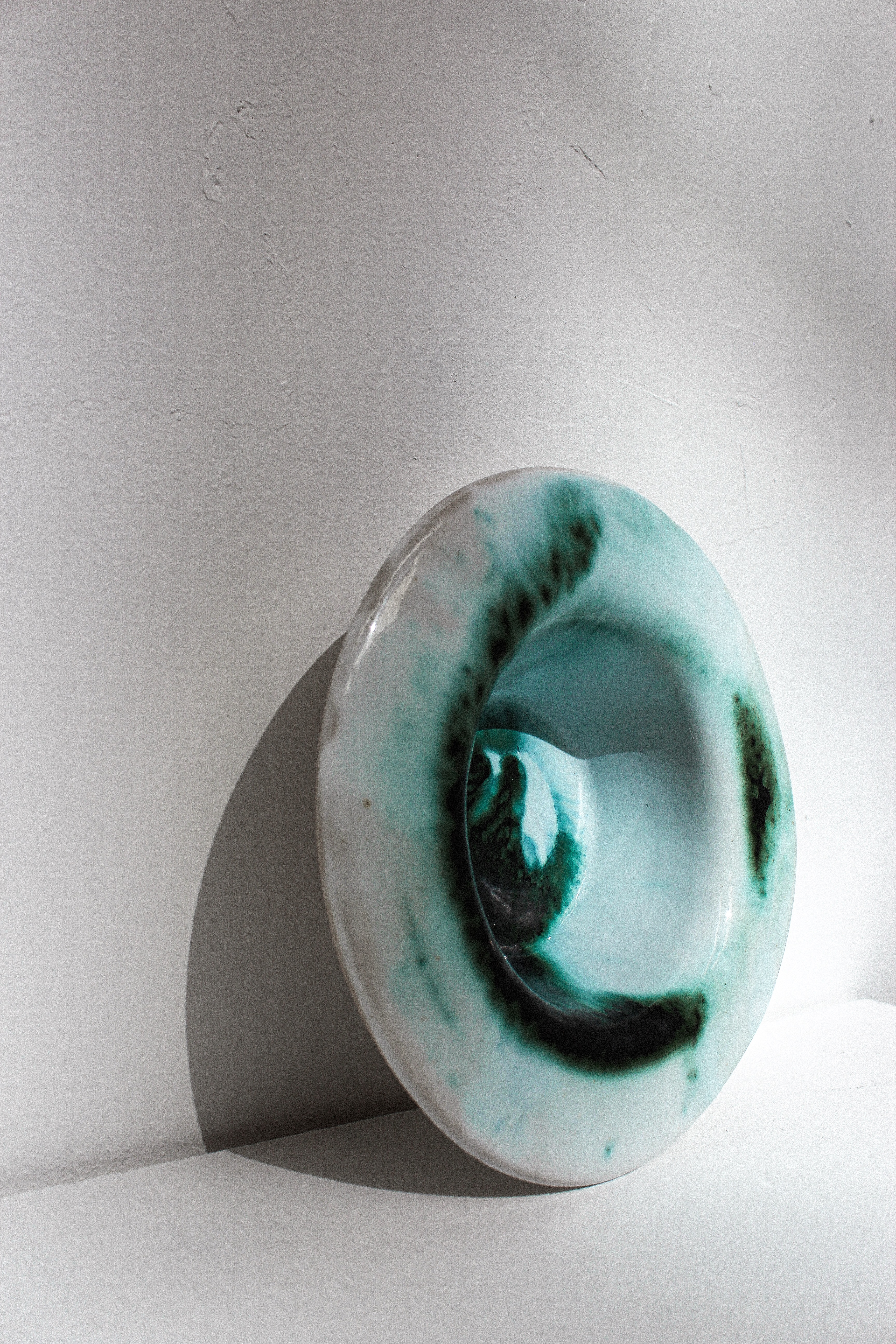
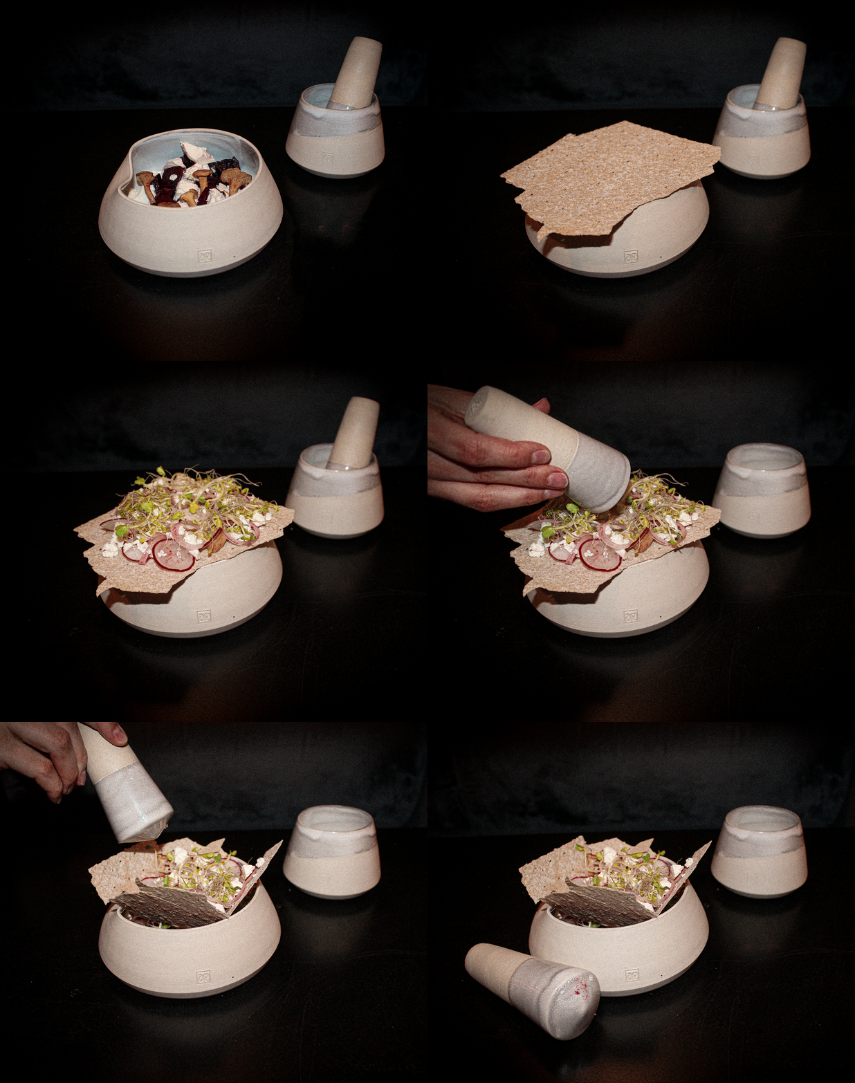
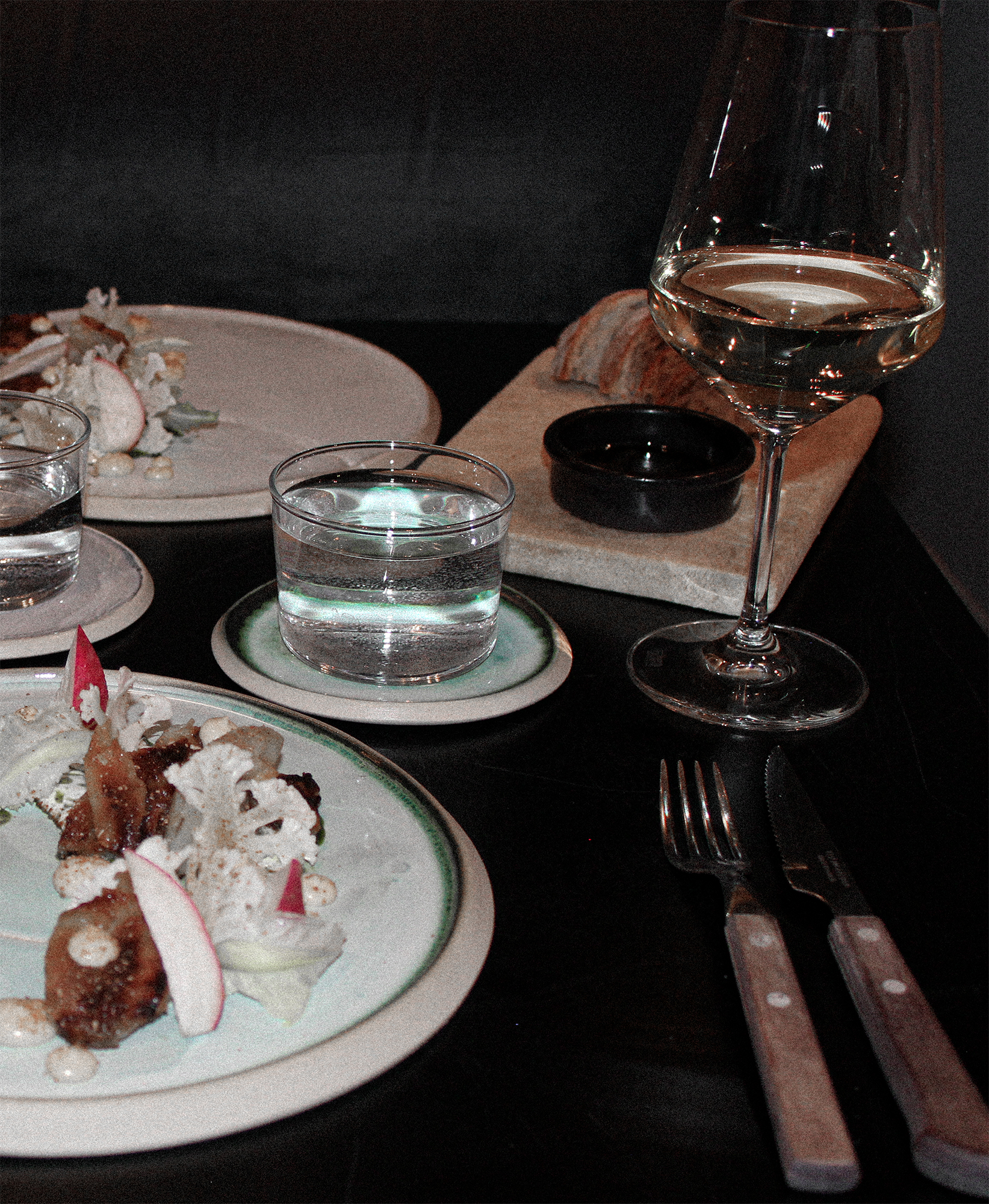
This is my bachelor project where I have chosen to combine my two biggest passions, food and design. The project involves an identity design that emphasizes proximity, experiences and presence during the meal. The goal of this project is to strengthen the experience and presence during a meal, and influence the customer's dining experience.
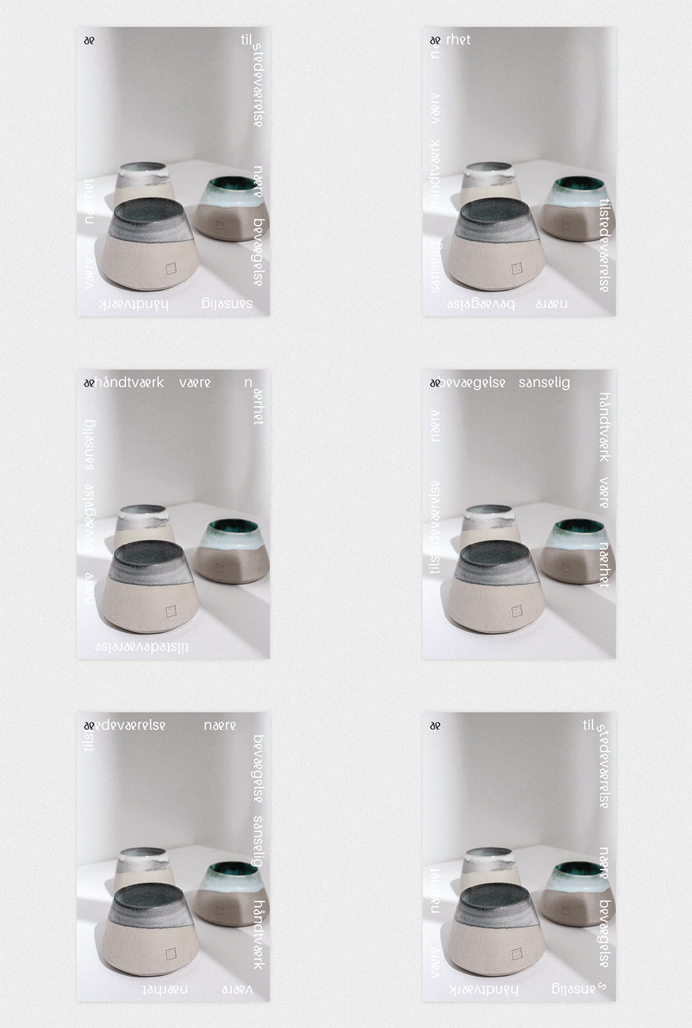
The identity mainly consists of a logo and associated customized letterforms, various paper-based elements, photography, packaging, motion posters, business cards and a handbook to represent the ceramics studio ae ceramics.The core values of ae ceramics are proximity, movement, presence and handmade craft / handmade food, something I have tried to communicate through both the development of crockery and its identity. I want to stand out by using more agile and playful design but still keep it simple. I aim to bring this out through my tone of voice and playful compositions to create dynamics and contrasts in the visual identity.
Every piece in this project is handmade and manufactured by me, Anny Follesøy, in Bergen, Norway.
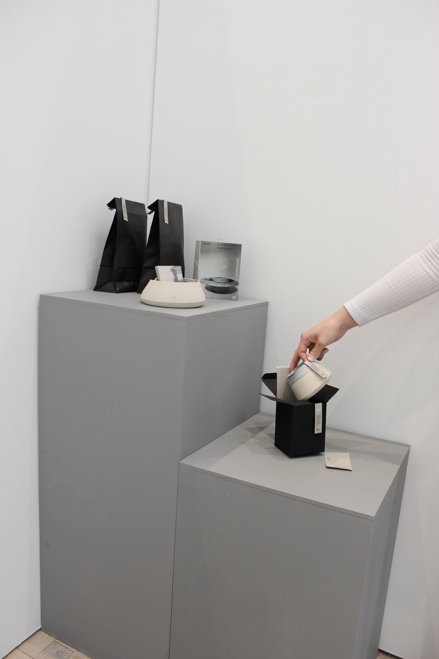


Packaging
--
--
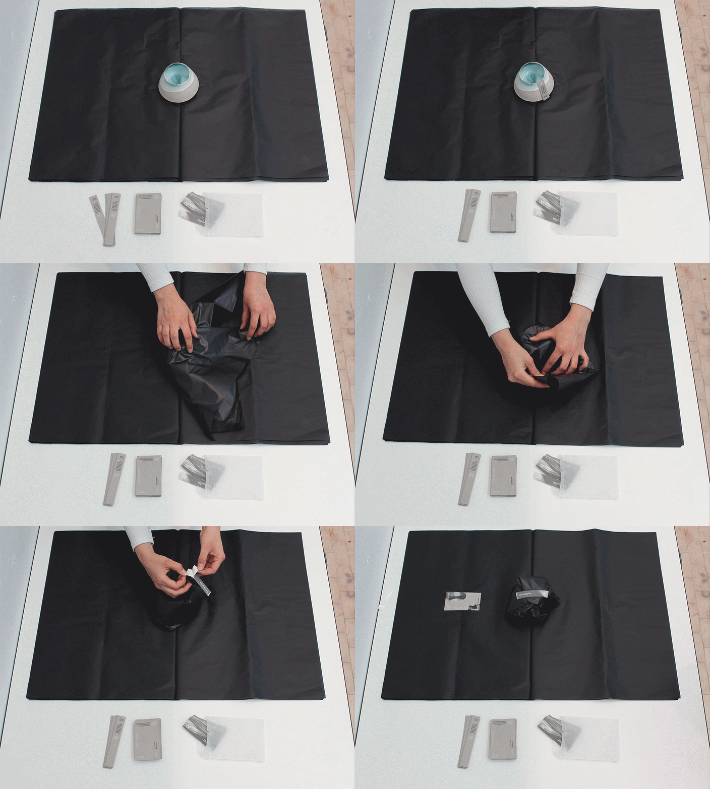
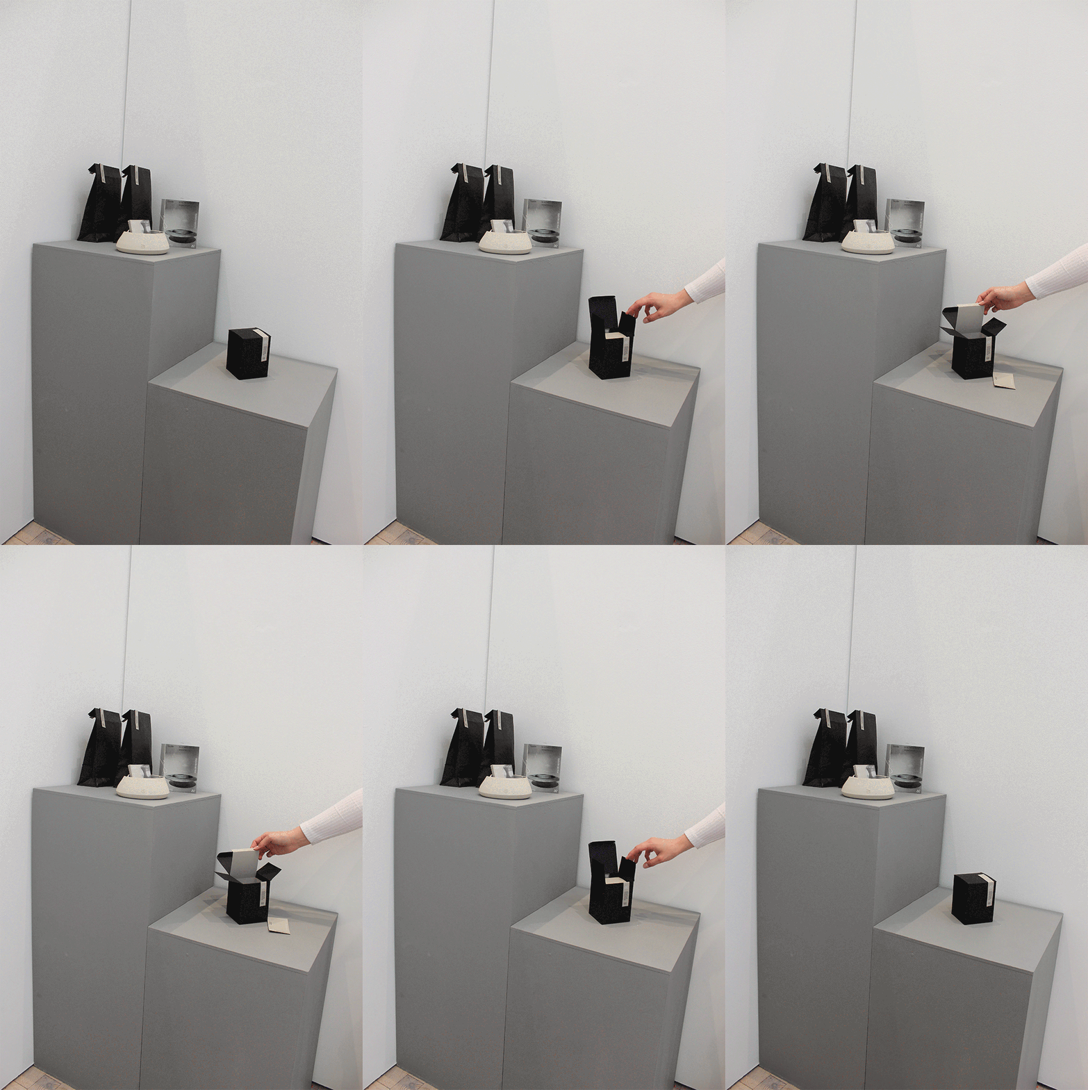
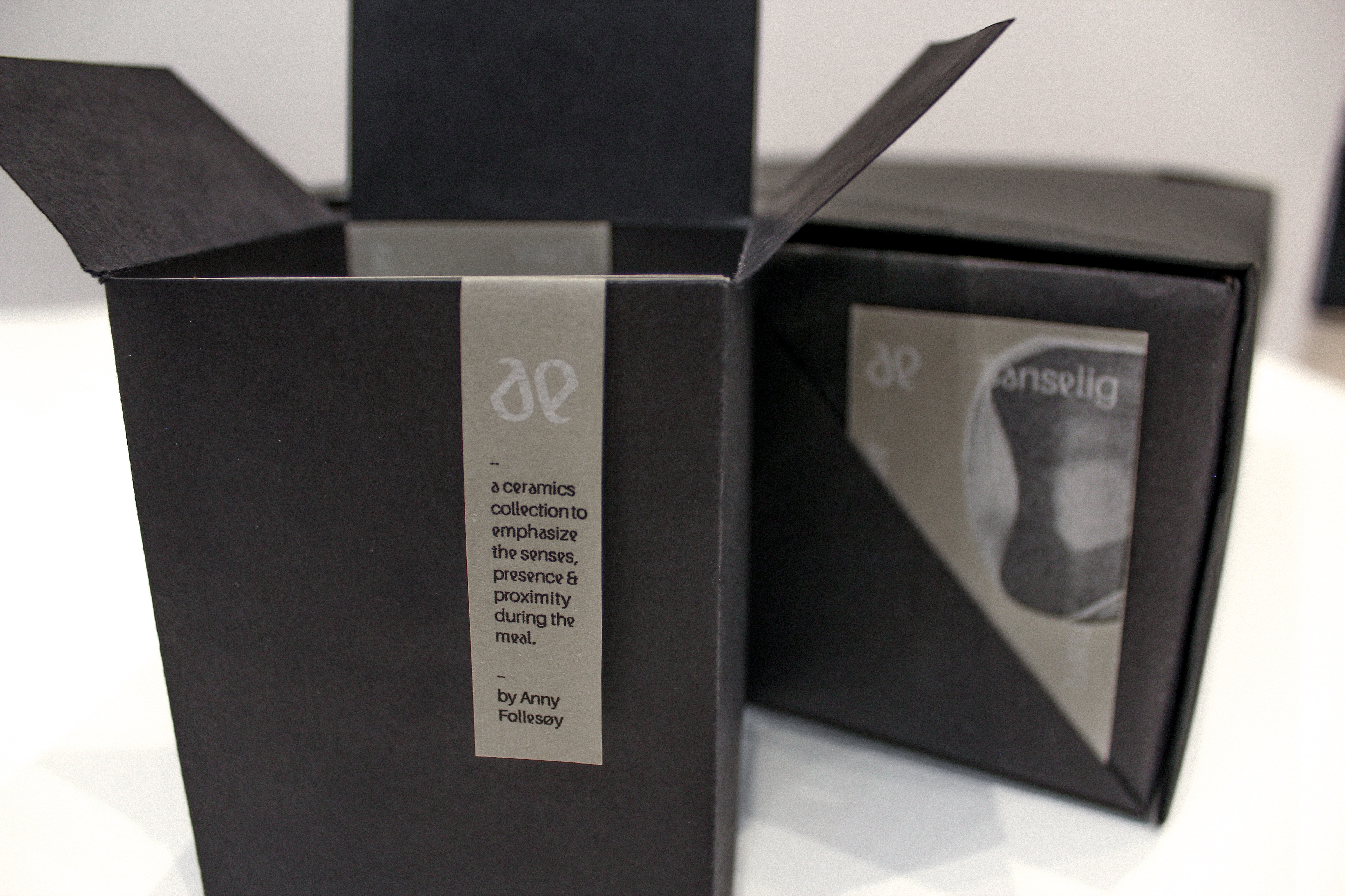
Black, simple packaging that brings out the color of the tableware and clay.
Elements:
Black tissue paper for tactile protection.
Stickers.
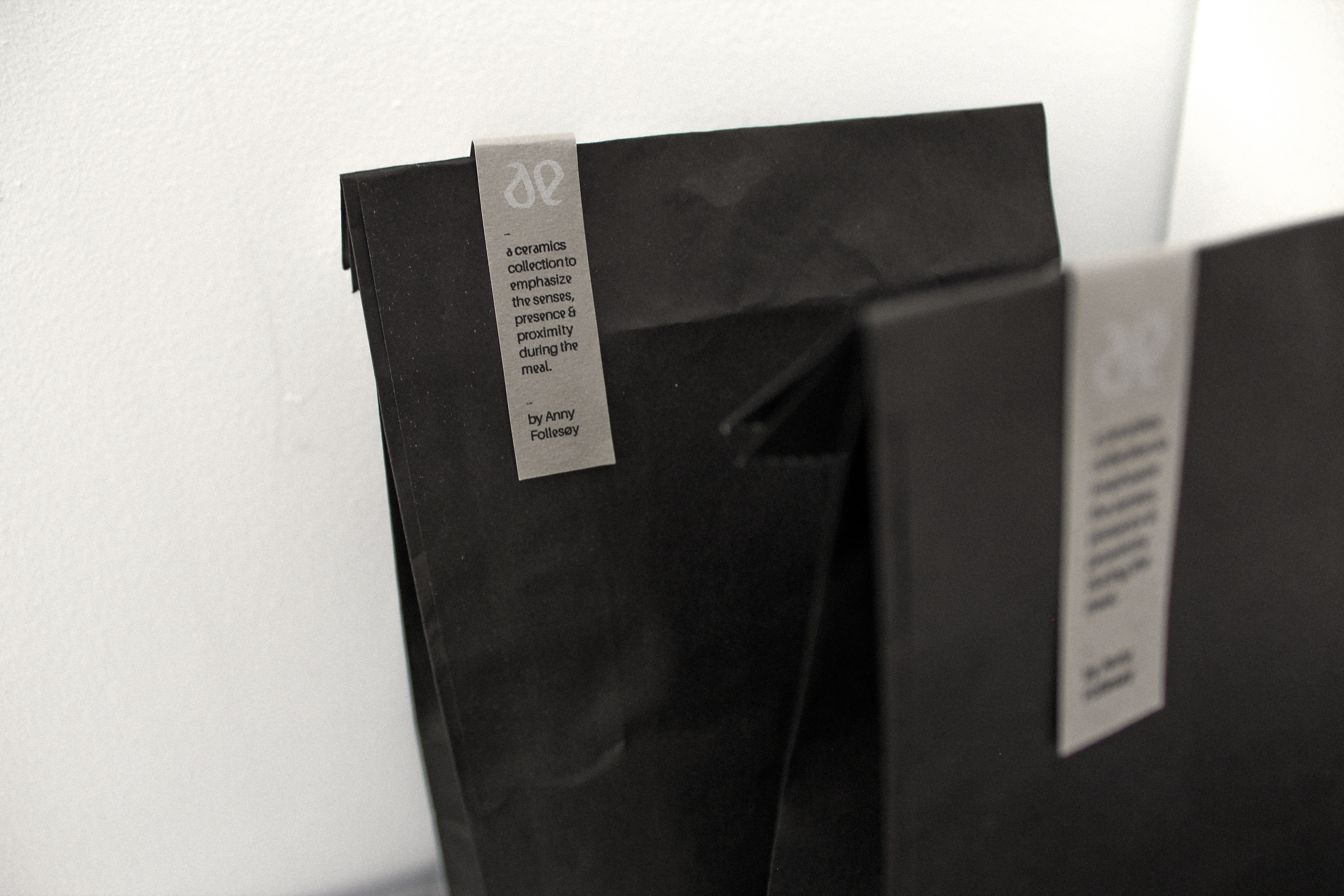
Labels / tags.
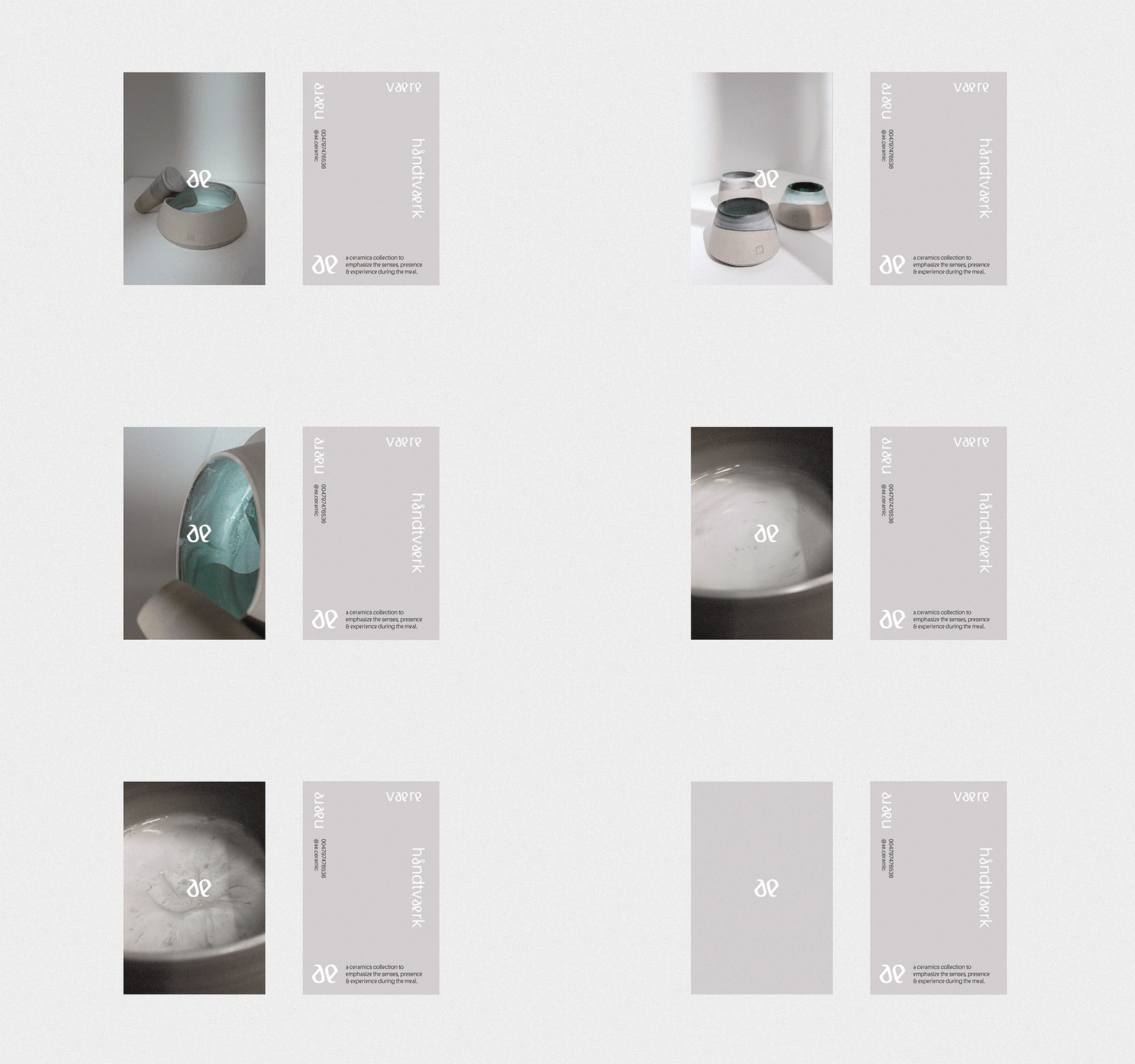
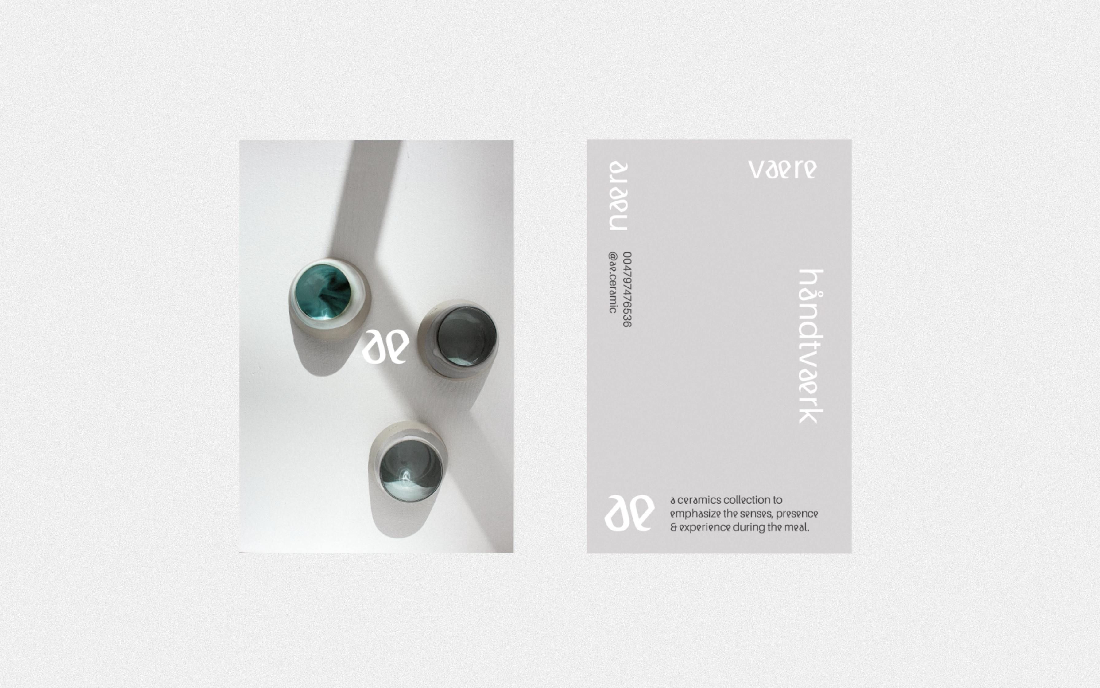
Business cards.
Small box / paper bags for smaller products, such as cups or a mortar.
Large box for bigger or more products, such as plates or bowls.
Elements:
Black tissue paper for tactile protection.
Stickers.
Labels / tags.
Business cards.
Small box / paper bags for smaller products, such as cups or a mortar.
Large box for bigger or more products, such as plates or bowls.




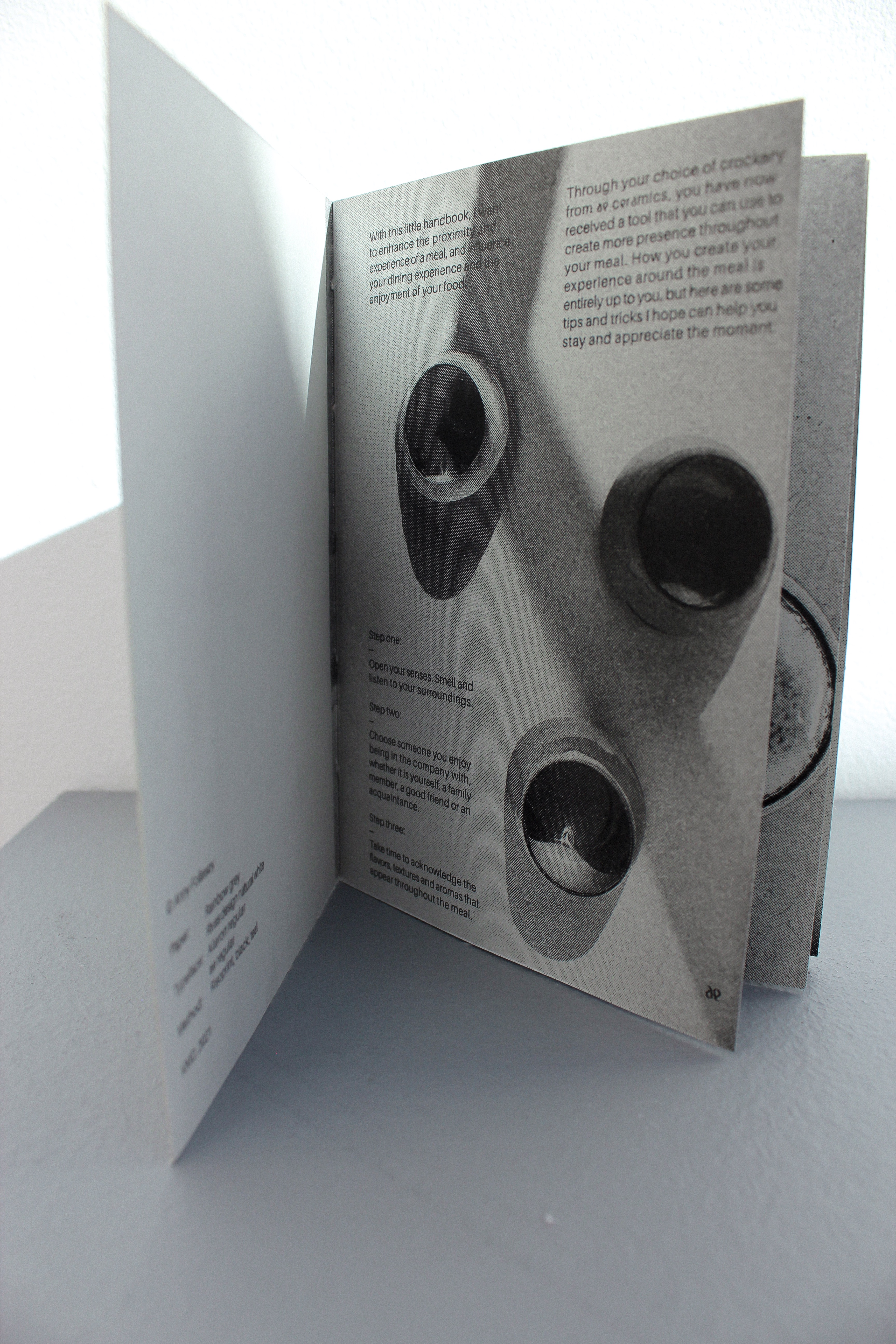
Handbook
--
--
that comes with the purchase of a product. It contains an introduction to the company's values and goals, connects research and different strategies to be more present during the meal. The handbook's purpose will be to bring the customer into the world of ae ceramics, and take better care of the everyday moments.
Article about the project in Norwegian
Article about the project in Norwegian



Promotion of the product
--
--
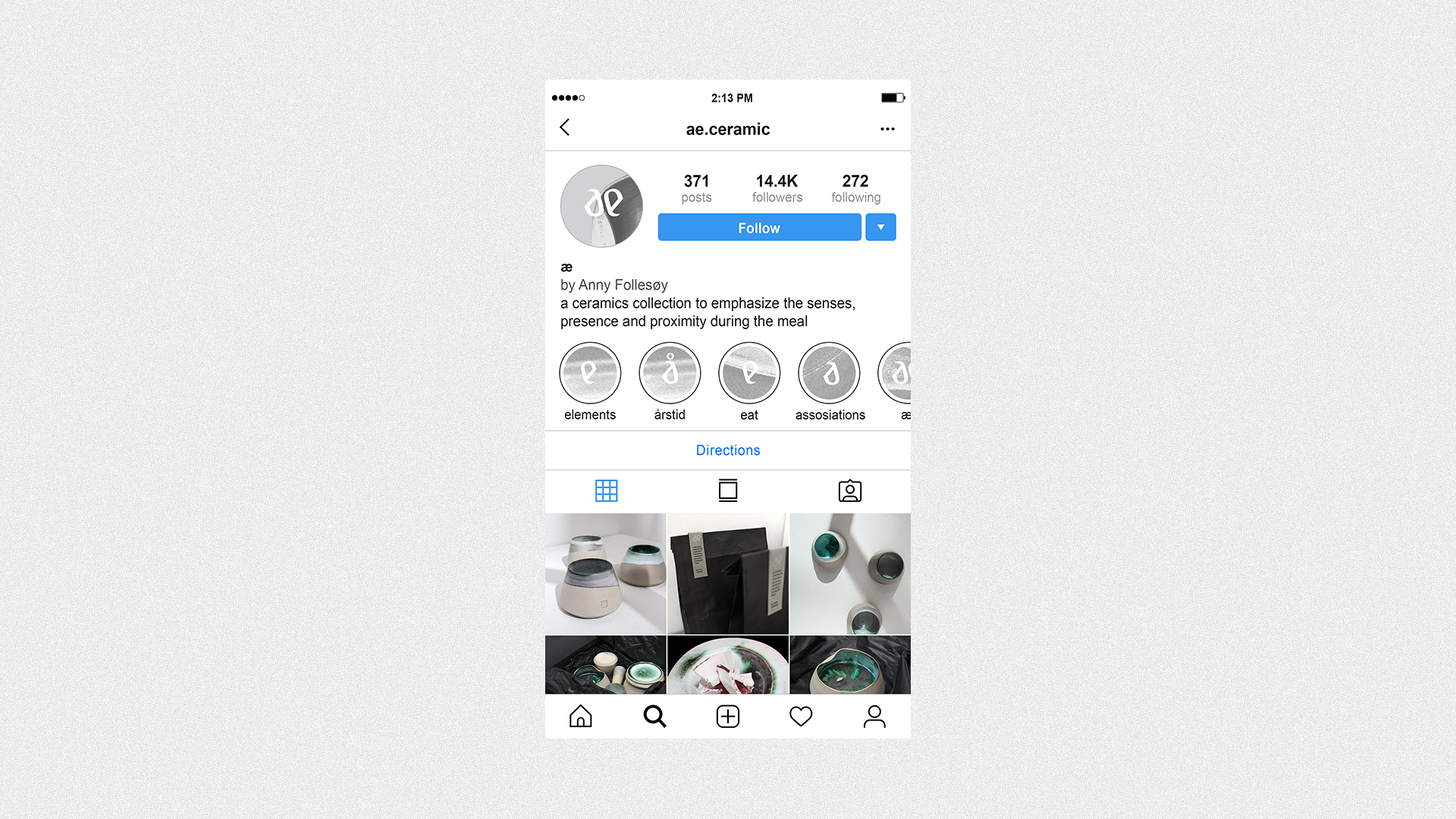
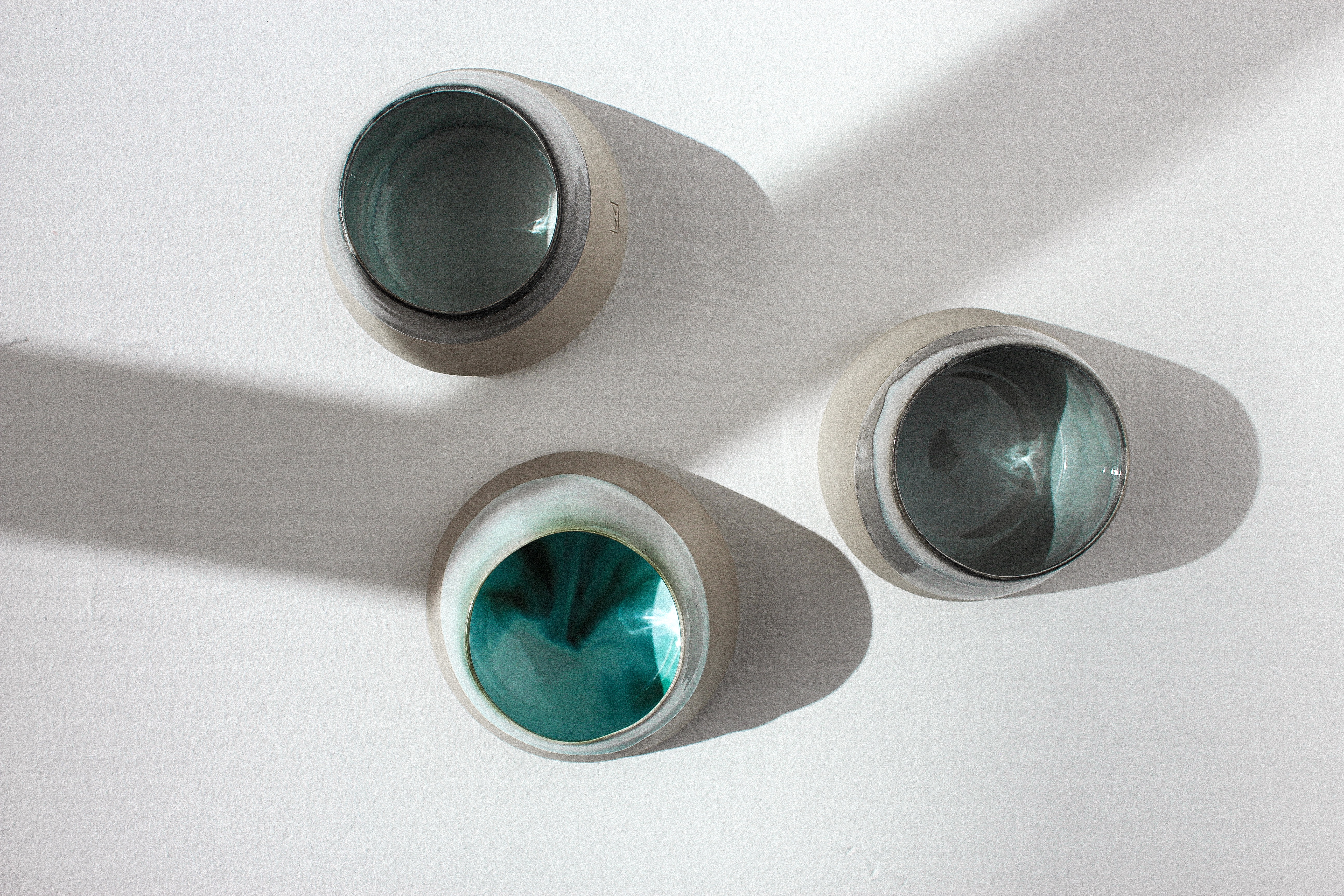
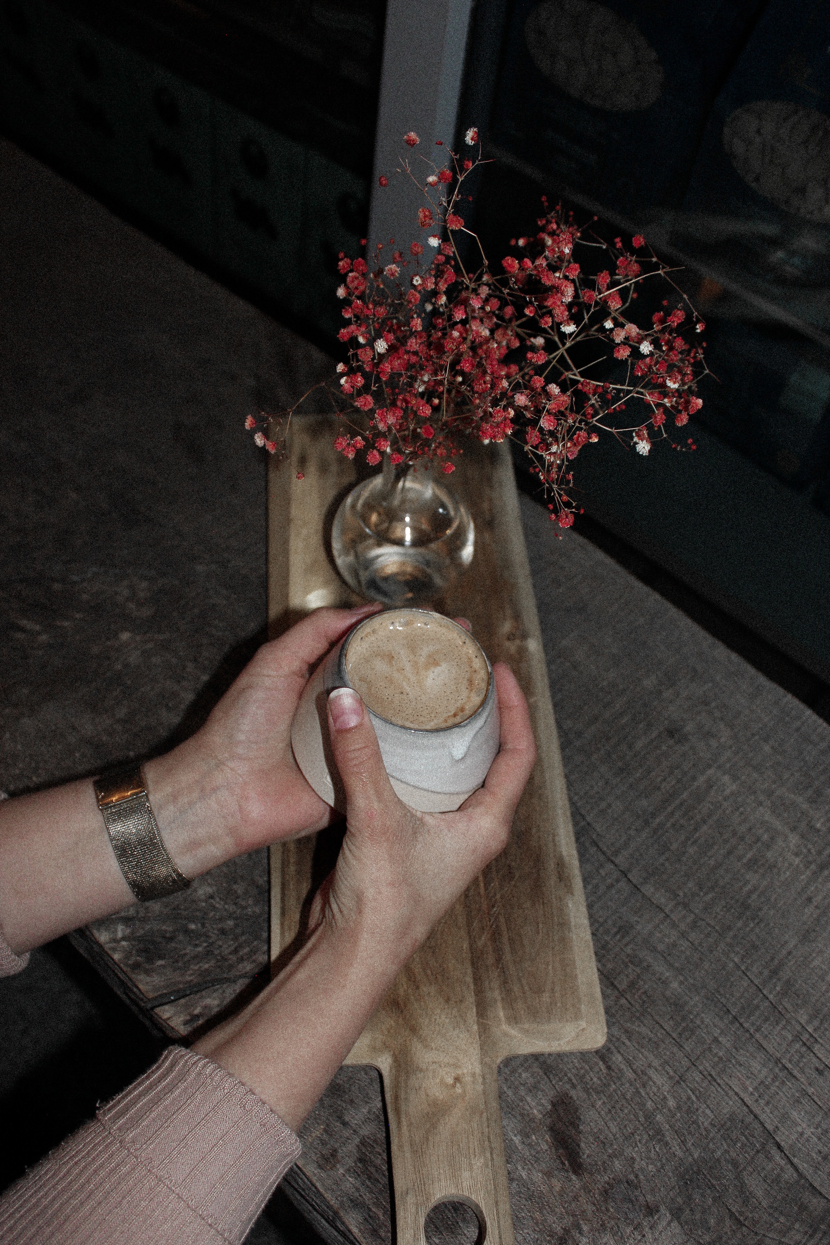
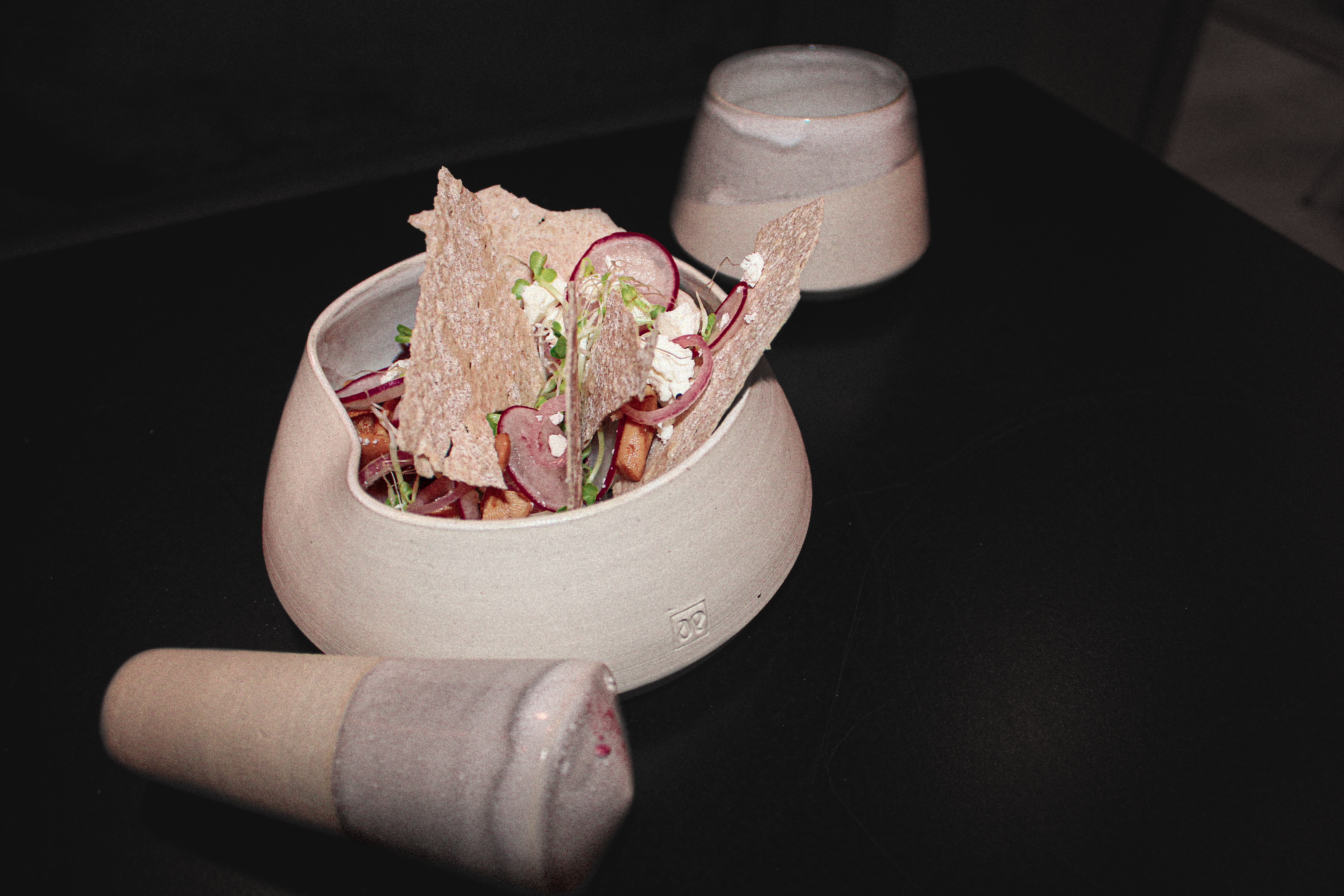
Presence and proximity are important values in this tableware and its identity. I would want the customers to be able to feel the ceramics, and thus would not be natural for it to be sold via an online store. Possible outlets could be at cafes, restaurants or local design shops. Promoted through social media.
