Ekko
--
Type: Identity proposal
Design by: Anny Follesøy
Year: 2019
--
Type: Identity proposal
Design by: Anny Follesøy
Year: 2019
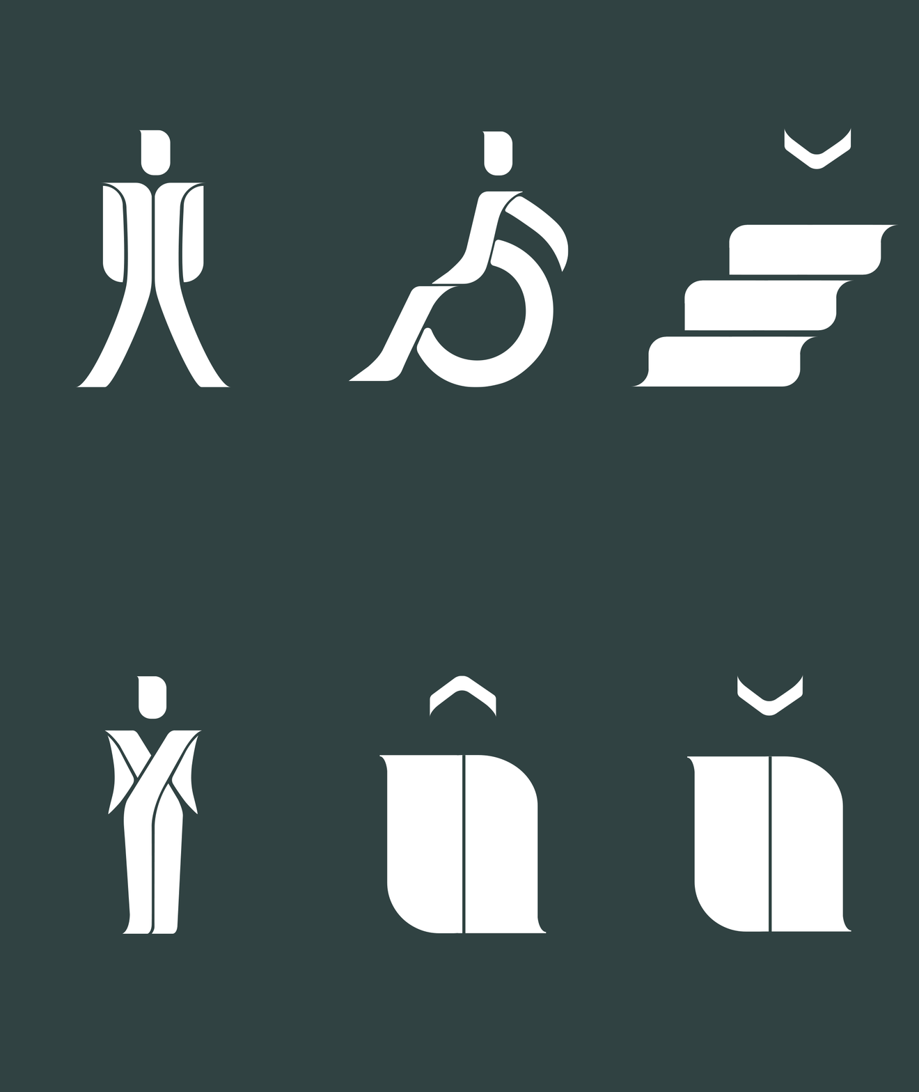
This project is a proposal for a new identity for the organisation called "Framtiden i våre hender" (English translation: “The future in our hands”.) This is a project about an organization we were assigned to redesign. The new identity should mainly contain a new name, logotype, colors, and preferably a pictogram.
Through the naming process, we came up with a phrase that I thought fit so wonderfully great "Put light on the villain / lighting up the ignorant". What I wanted to bring out with this warm yellow-orange color was to light up what people don't see or know, and let the echoes shine forth. The new name and identity proposal I believe fits the organisation's core values and communicates their goals and visions. Here is my suggestion:


The organization stands for, among other things, global justice, ecological balance, ethics and sustainability. We did the naming process as a group, where we primarily did research on the company's core values and work, and then came up with many names based on this. We had some rounds of elimination and finally came up with three names we could choose from.
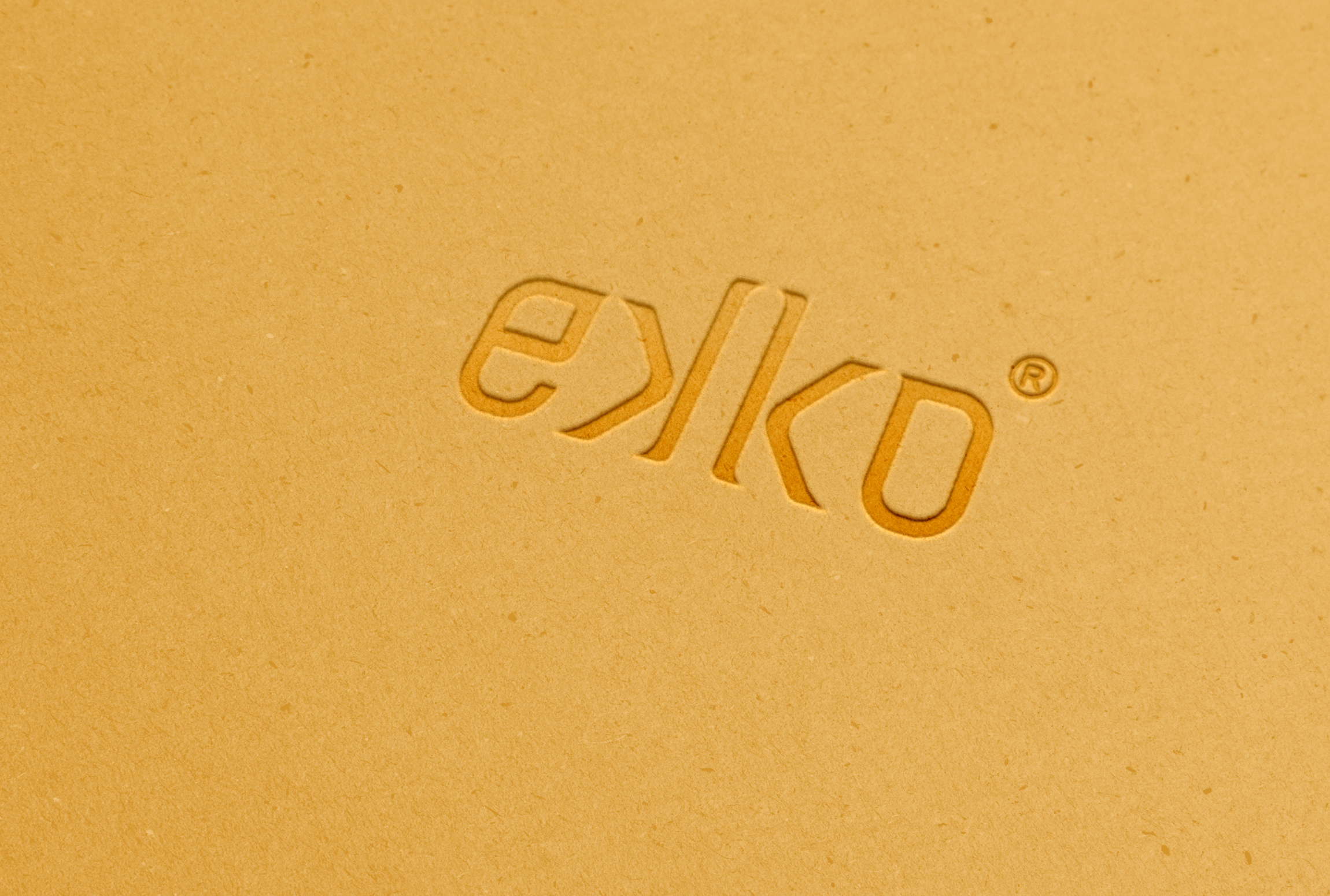
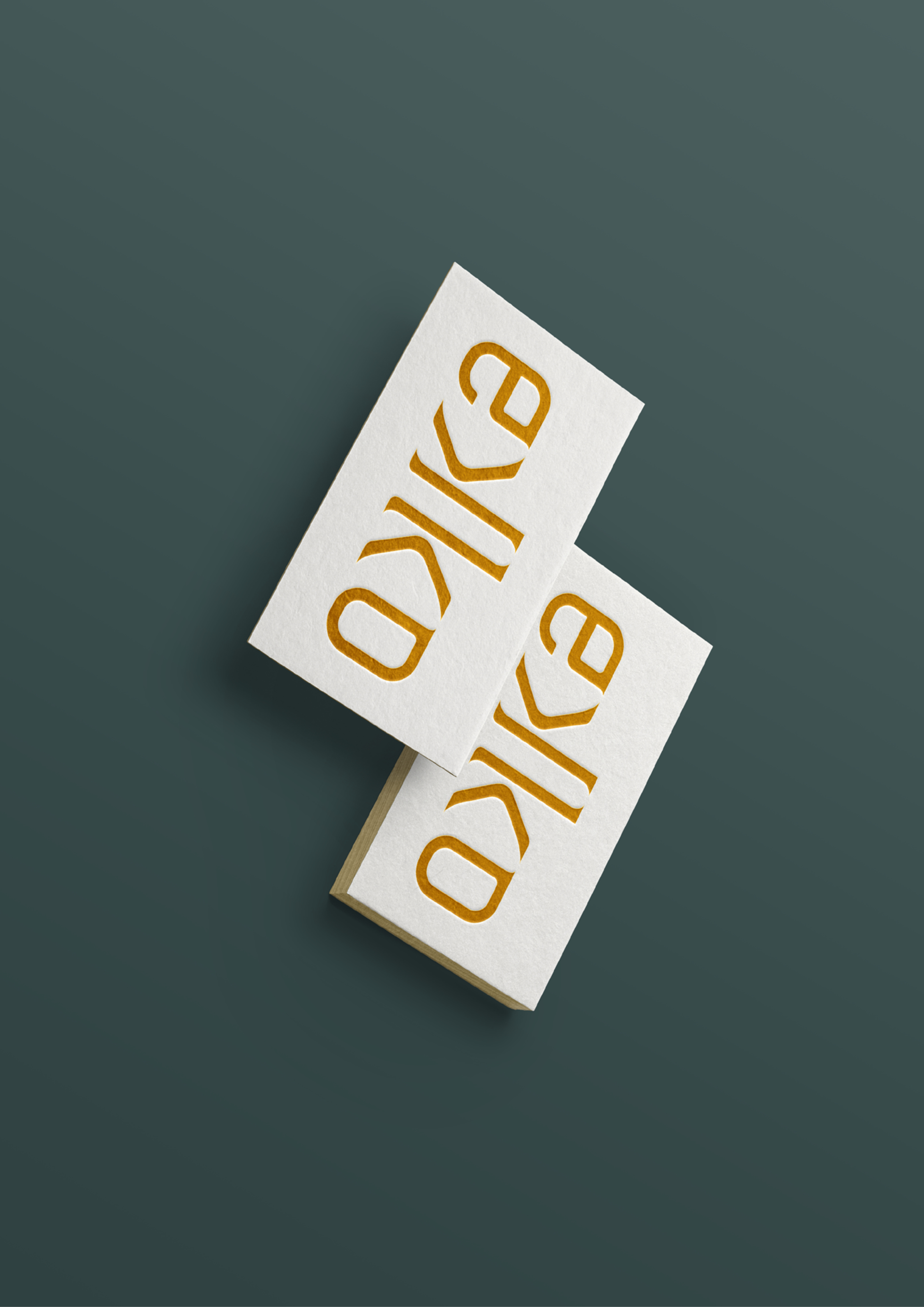
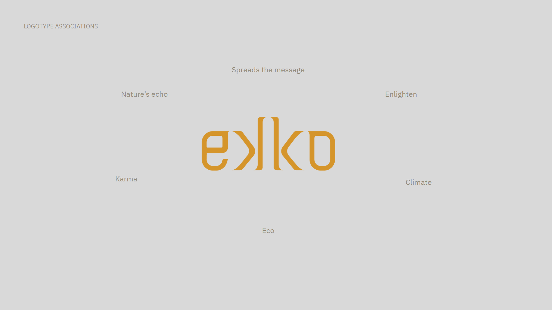
I went for the word that was the easiest to understand in most languages and that I felt fit their values best. The name is "Ekko" (English translation: "Echo"). When you shout something, an echo can often be formed, the sound hits a wall and then comes back to you, a bit like in karma, "what goes around, comes around". If you treat nature well, nature do good things for us in return. It’s the echo of nature. This is also the reason why I flipped the k's, to form a kind of echo, which spreads a message, like the organization disseminates information about, for example, what the working conditions of textile workers really are like.
The logotype is made up of soft round shapes in combination with sharp edges, to communicate that their thought is always good, but it’s often necessary to be strict and put pressure on companies to bring out the right information.
The logotype is made up of soft round shapes in combination with sharp edges, to communicate that their thought is always good, but it’s often necessary to be strict and put pressure on companies to bring out the right information.

